Petrovax restyles its logo
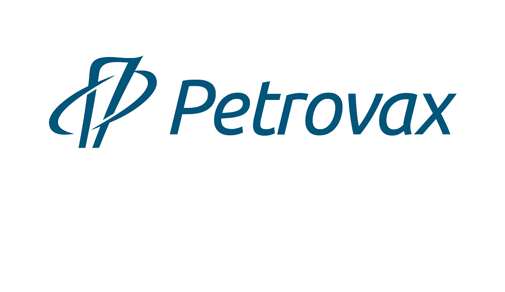
The modern world is very dynamic, and Petrovax keeps moving, growing, and developing as well. The changes underway relate to the corporate visual identity. In November, Petrovax restyled its logo to make it simpler and more state-of-the-art while preserving its individual touch and consistency.
The new logo is readily recognizable and memorizable. It is a combination of graphical symbols with easy-to-see stylized Cyrillic letters П (for Petrovax) and Ф (for pharma). The visual style perception has improved due to monochrome color solution and modern lettering of Petrovax that complements the logo’s shape elements.
This state-of-the-art style of Petrovax’s logo reflects the company’s new strategy aimed at product portfolio expansion and intensive international integration. At the same time, the retained basic elements of the artwork demonstrate that the company has a robust business model based on a unique history.
![]()